Chiaroscuro
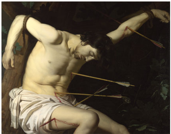
Saint Sebastian, oil on canvas, about 1623, 101 x 117cm by Gerrit Van Honthorst 1592-1656
This is “a term used to describe the effects of light and dark in a work of art, particularly when they are strong contrasting”
Interestingly it goes on to explain that chiaro means light or clear and scuro means dark in the Italian language, so a perfect term for this technique. Its application and accepted understanding has changed and developed over time but for this exercise I looked at the simple contrasting of light and dark. I studied this painting to begin to learn about this technique and how I could interpret and apply the technique in my own work.
This painting clearly uses Chiaroscuro and to big dramatic effect! Initially, the contrast between the pale skin of the Saint Sebastian, his hair, the ropes and the background is striking, this without taking into account the gruesome nature of the subject. The National Gallery offers the following as a brief outline of Saint Sebastian:
“Sebastian was a Roman centurion, who was discovered to be a Christian and was sentenced to death by Emperor Diocletian. He was bound to a stake and shot with arrows. He was left for dead, although the arrows had not killed him and he was eventually stoned to death. The story is taken from the ‘Golden Legend’.”
When I initially looked at the thumbnail, I assumed the dark background was one continuous colour, nondescript with nothing really to look at. I love the National Gallery website because you can zoom right into each painting and really study it, right down to the brushstrokes. I was really surprised to see the outline of the tree, familiar in the shape of a crucifix, with leaves and foliage shadowed behind him which are more distinctive toward the bottom right hand corner.
This painting sets out to display the horrific nature of man against man, the consequences of a man following the ‘wrong’ religion. Once the shock of such beliefs and behaviours settled, I began to analyse how I’d looked at the image, how had I missed the background so completely. Initially I’d started to view from the bottom left corner, vertically straight up, flitting across to the arrows in his flesh as I moved upwards. Only then, after studying his face, did I move down to the right hand corner to then start the process again. The background was unimportant to the story being told in the picture, even without being forearmed by the National Gallery to the story of Saint Sebastian. Only as I panned in did I realise there was more to the background and now I’m wondering if there is particular meaning to the flora/fauna used in the ghostly shapes.
There’s also a real luminosity to the mans skin and body, I assume the artist painted onto a white or light coloured ground in order to help achieve this effect.
2.Henry Moore - Movement and textures
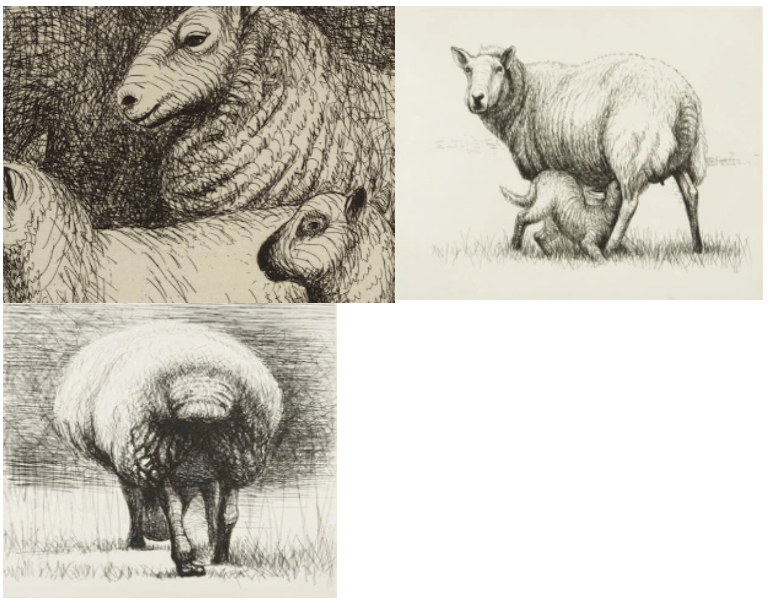
These sheep sketches are wonderful- they are fluid and expressive, whilst capturing the very essence of the sheep. I notice how there are few actual outlines-Moore – rarely started his sketches by outlining his sheep but started shading straight away. He relied on varying the tone to capture light and shadow, form (the round solidity of a sheep) and shape (insinuating the shape of the nail’s body beneath the fleece). Texture is captured also- the curly fleece, the hard short hair on their heads…. I really like the way that the lines vary in direction and pressure.
In 1972 Henry Morre’s studio looked out over fields from where he drew these sheep- that would come right up to his window. As a sculpture he was interested in form and texture and in spite of using just biro and felt tip the sketches are animated, interesting and individual. He would make a loud noise to capture the sheep’s attention while he caught their captivated gaze.. Zig-zags and rushed ball point pen lines dominate the drawings, thicker and more panicked scratches where there is less light and softer yet vigorous marks on the brighter parts of the scene.
He captures the sheep’s energy and sudden vigorous movement as well as their repose and calm thoughtfulness. (Do sheep think?)
In making each sketch so individual and tender he captures his audience. It is more than just a picture of a sheep- it communicates mood, atmosphere, and the character of the animals.
I want to be inspired by these lovely drawings to let go of my fear of getting it wrong and allow spontaneity, energy and fluidity into my drawings. Concentrating on tone and texture rather than just purely line!
2.Henry Moore - Movement and textures
These sheep sketches are wonderful- they are fluid and expressive, whilst capturing the very essence of the sheep. I notice how there are few actual outlines-Moore – rarely started his sketches by outlining his sheep but started shading straight away. He relied on varying the tone to capture light and shadow, form (the round solidity of a sheep) and shape (insinuating the shape of the nail’s body beneath the fleece). Texture is captured also- the curly fleece, the hard short hair on their heads…. I really like the way that the lines vary in direction and pressure.
In 1972 Henry Morre’s studio looked out over fields from where he drew these sheep- that would come right up to his window. As a sculpture he was interested in form and texture and in spite of using just biro and felt tip the sketches are animated, interesting and individual. He would make a loud noise to capture the sheep’s attention while he caught their captivated gaze.. Zig-zags and rushed ball point pen lines dominate the drawings, thicker and more panicked scratches where there is less light and softer yet vigorous marks on the brighter parts of the scene.
He captures the sheep’s energy and sudden vigorous movement as well as their repose and calm thoughtfulness. (Do sheep think?)
In making each sketch so individual and tender he captures his audience. It is more than just a picture of a sheep- it communicates mood, atmosphere, and the character of the animals.
I want to be inspired by these lovely drawings to let go of my fear of getting it wrong and allow spontaneity, energy and fluidity into my drawings. Concentrating on tone and texture rather than just purely line!
Chiaroscuro
Saint Sebastian, oil on canvas, about 1623, 101 x 117cm by Gerrit Van Honthorst 1592-1656
This is “a term used to describe the effects of light and dark in a work of art, particularly when they are strong contrasting”
Interestingly it goes on to explain that chiaro means light or clear and scuro means dark in the Italian language, so a perfect term for this technique. Its application and accepted understanding has changed and developed over time but for this exercise I looked at the simple contrasting of light and dark. I studied this painting to begin to learn about this technique and how I could interpret and apply the technique in my own work.
This painting clearly uses Chiaroscuro and to big dramatic effect! Initially, the contrast between the pale skin of the Saint Sebastian, his hair, the ropes and the background is striking, this without taking into account the gruesome nature of the subject. The National Gallery offers the following as a brief outline of Saint Sebastian:
“Sebastian was a Roman centurion, who was discovered to be a Christian and was sentenced to death by Emperor Diocletian. He was bound to a stake and shot with arrows. He was left for dead, although the arrows had not killed him and he was eventually stoned to death. The story is taken from the ‘Golden Legend’.”
When I initially looked at the thumbnail, I assumed the dark background was one continuous colour, nondescript with nothing really to look at. I love the National Gallery website because you can zoom right into each painting and really study it, right down to the brushstrokes. I was really surprised to see the outline of the tree, familiar in the shape of a crucifix, with leaves and foliage shadowed behind him which are more distinctive toward the bottom right hand corner.
This painting sets out to display the horrific nature of man against man, the consequences of a man following the ‘wrong’ religion. Once the shock of such beliefs and behaviours settled, I began to analyse how I’d looked at the image, how had I missed the background so completely. Initially I’d started to view from the bottom left corner, vertically straight up, flitting across to the arrows in his flesh as I moved upwards. Only then, after studying his face, did I move down to the right hand corner to then start the process again. The background was unimportant to the story being told in the picture, even without being forearmed by the National Gallery to the story of Saint Sebastian. Only as I panned in did I realise there was more to the background and now I’m wondering if there is particular meaning to the flora/fauna used in the ghostly shapes.
There’s also a real luminosity to the mans skin and body, I assume the artist painted onto a white or light coloured ground in order to help achieve this effect.